 Learn Arabic
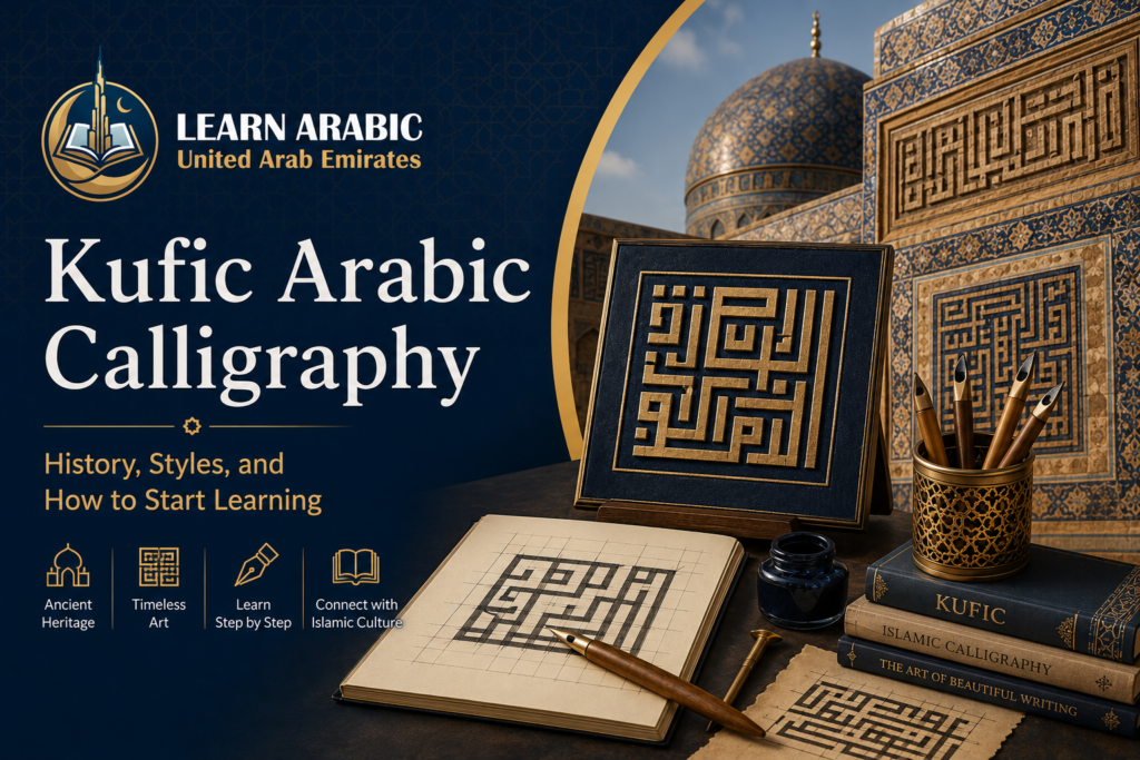
Kufic Arabic calligraphy is one of the oldest and most visually striking writing traditions in the world. If you have ever seen angular, geometric Arabic letters carved into mosque walls, woven into tilework, or printed on the flag of Iraq, you have already encountered it. Yet most people who admire it have no idea that Kufic is not a single style — it is an entire family of scripts, each with its own visual logic and purpose.
This guide covers the full picture: where Kufic came from, what makes each style distinct, how it spread across Islamic civilisation and into European art, and — most practically — what a beginner should know before picking up a pen or opening a grid template.
What Is Kufic Arabic Calligraphy?
arabic kufic calligraphy is the oldest calligraphic style of the Arabic script, defined by its strictly angular, rectilinear letterforms and a pronounced horizontal orientation. It developed in Kufa, a city in southern Iraq — then a major intellectual centre of the early Islamic world, sitting at the crossroads of the Silk Road — and remained the dominant script for Quran transcription from the 7th through to the 11th century.
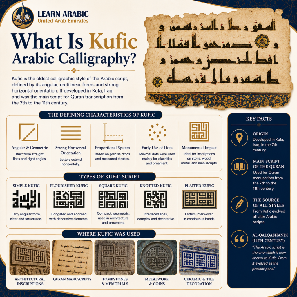
The script’s defining characteristic is its geometry. Where later Arabic scripts like Naskh and Thuluth use fluid curves and diagonal strokes, Kufic is built from straight lines, right angles, and calculated proportions. Al-Qalqashandi, the renowned 14th-century Egyptian encyclopedist, described it plainly: “The Arabic script is the one which is now known as Kufic. From it evolved all the present pens.”
That sentence is not hyperbole. Kufic is the root from which the entire tree of classical Arabic scripts grew.

The History of Kufic Calligraphy
Arabic kufic calligraphy did not emerge fully formed. It developed through real necessity — the need to write down the Quran in a script that conveyed both accuracy and authority.
From Kufa to the Quran
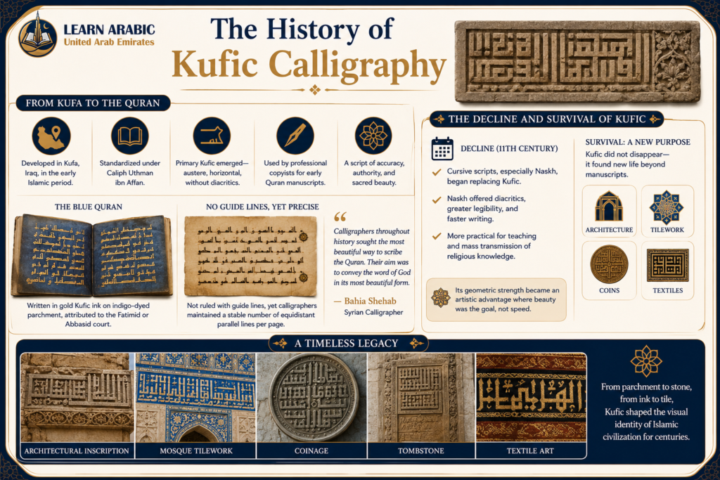
Early Muslims used various scripts in the first decades of Islam, but as the Quran’s text was standardized under the third caliph, Uthman ibn Affan, a more authoritative visual form emerged. What coalesced became known as Primary Kufic — an austere script with a low vertical profile, strong horizontal emphasis, and no diacritical marks to distinguish similar letters.
Professional copyists used this form to produce the earliest surviving Quran manuscripts, written on parchment and dated to the 8th and 9th centuries. One outstanding example is the Blue Quran — a manuscript written in gold Kufic ink on parchment dyed with indigo, attributed to either the Fatimid or Abbasid court. The Syrian calligrapher Bahia Shehab captures why this mattered: “Calligraphers throughout history sought the most beautiful way to scribe the Quran. Their aim was to convey the word of God in its most beautiful form.”
Kufic manuscripts were not ruled with guide lines, yet calligraphers maintained a stable number of equidistant parallel lines per page — a level of precision that historian Alain George describes as “all the more remarkable” given the absence of physical guides.
The Decline and Survival of Kufic
By the 11th century, cursive scripts — particularly Naskh — began replacing Kufic in Quran transcription. Naskh offered diacritical marks, greater legibility, and faster writing speed, making it more practical for teaching and mass transmission of religious knowledge. Kufic did not disappear; it migrated. It moved from manuscripts into architecture, tilework, coins, and textiles — where its geometric character became an artistic strength rather than a legibility liability.
See Our Classroom Environment in Action
Experience a sneak peek into our live sessions. Watch the video below to see our specialized instructors interacting with students, breakdown complex texts, and cultivate an engaging, respectful learning environment.
Master Arabic in the UAE
Experience world-class Arabic language training designed for students and professionals in the Emirates.
Book Your Free TrialRead More: Thuluth Arabic Calligraphy
The Main Styles of arabic calligraphy kufic
Kufic is not one script. It is a family. Understanding the distinctions between its main forms helps both learners and admirers make sense of what they are looking at.
1. Square Kufic
Square Kufic — also called Chessboard Kufic or banna’i (بَنَائِيّ, meaning “masonry script”) — is the most geometric of all Kufic styles. It developed in the 12th century, originating in Iraq and becoming prominent in Iranian architecture, where bricks and tiles function as pixels.
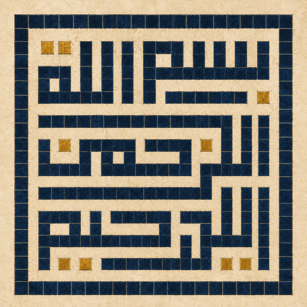
Its origins trace back to hazaar baf, an ancient technique from Iraq and Iran of arranging differently coloured bricks in vertical and horizontal patterns to produce geometric and calligraphic forms. Square Kufic took that brick-logic and converted it into pure letterform. Each letter is built on a grid, with one pixel (one unit square) as the basic unit of construction.
The Syrian calligrapher Mamoun Sakkal described its development as “an exceptional step towards simplification in Kufic styles that evolved towards more complexity in the preceding centuries.”
Legibility is not the goal of Square Kufic. Authority, symmetry, and visual weight are. This is why it covers minarets, tiles entire mosque facades, and appears in logos of Islamic institutions — it commands attention through structure.
2. Floriated Kufic
Floriated Kufic adds leaf, flower, and vine extensions to the vertical letter strokes, transforming the ends of letters into plant-like ornamental terminals.
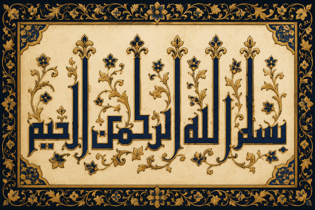
It was used extensively on tiraz textiles — embroidered garment bands in the early Islamic courts — and in manuscript headings from the 9th and 10th centuries. The floriated extensions often include the name of God or a ruler, embedding authority into decorative form.
3. Knotted Kufic
Knotted Kufic interweaves letter strokes into interlaced patterns, giving the text a rope or knot-like texture.
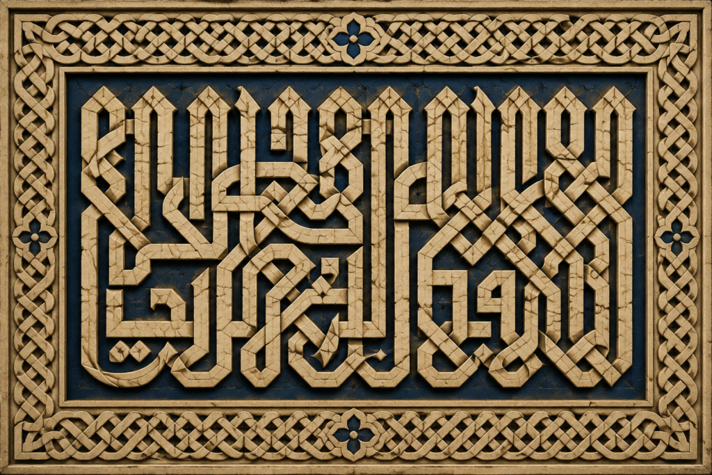
Like floriated Kufic, it prioritises visual complexity over easy reading. It appears most often in architectural inscription, where reading the script is secondary to experiencing it as pattern.
Read More: Arabic Cursive Writing
Kufic Calligraphy’s Reach – From Islamic Art to European Painting
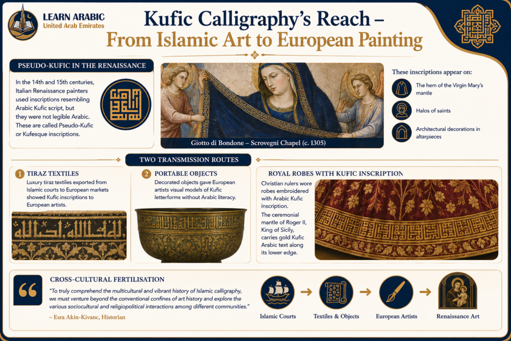
One of the most fascinating chapters in Kufic Arabic calligraphy’s history is how it crossed civilisational boundaries and appeared in European religious art — often in contexts where no one painting or viewing the work could read Arabic.
Pseudo-Kufic in the Renaissance
In the 14th and 15th centuries, Italian Renaissance painters — including Giotto di Bondone — began using inscriptions in their works that resembled Arabic Kufic script but were not legible Arabic. These are called Pseudo-Kufic or Kufesque inscriptions. They appear on the hem of the Virgin Mary’s mantle, on halos of saints, and on architectural decorations in altarpieces.
Two transmission routes explain this: luxury tiraz textiles exported from Islamic courts to European markets, and portable decorated objects that gave European artists visual models of Kufic letterforms without Arabic literacy. Christian rulers wore robes embroidered with Arabic Kufic inscription — the ceremonial mantle of Roger II, King of Sicily, carries gold Kufic Arabic text along its lower edge.
Historian Esra Akin-Kivanc describes this as cross-cultural fertilisation: “To truly comprehend the multicultural and vibrant history of Islamic calligraphy, we must venture beyond the conventional confines of art history and explore the various sociocultural and religiopolitical interactions among different communities.”
The One Rule That Governs Square Kufic Construction
Most introductions to Square Kufic mention that it uses a grid. What they underexplain is why the grid matters — and what it controls.
The governing principle is the ratio of white space to black space. In correctly executed Square Kufic, the width of each letter stroke equals the width of the space between strokes. One unit of black, one unit of white — everywhere, consistently. When this ratio breaks down, the composition visually collapses even if individual letters are correctly shaped.
This 1:1 ratio is not a stylistic preference. It is a structural constraint inherited from the hazaar baf brick tradition, where you cannot place half a brick. Every element is one full unit or it does not exist. Three common errors follow from misunderstanding this:
- White spaces narrower than the unit of measurement — letters feel crushed
- Incorrect letter shapes where strokes are too wide or too narrow for the grid
- Improper letter spacing where the gap between letters breaks the 1:1 balance
This is why Square Kufic calligraphy can be evaluated objectively. As Nihad Taisir Nadam notes, “a finished work can then be qualitatively judged rather than only appreciated as an abstract piece.”
Which Kufic Style Should Beginners Start With?
Choosing the right Kufic style at the beginning makes the learning process much easier. Use the following framework to decide where to start.
1. Start with Square Kufic for Structured Learning
Square Kufic is the best option for beginners who enjoy precision and geometric design. It follows a strict grid system, making every stroke measurable and easy to evaluate. If you use Adobe Illustrator, Inkscape, or simply enjoy drawing on graph paper with a ruler, this style offers the fastest learning curve because mistakes are immediately visible and easy to correct.
2. Choose Classical Kufic to Build Traditional Skills
If you already have experience with Arabic calligraphy or writing with a traditional reed pen (Qalam), Classical Kufic is the better starting point. It teaches the original letter anatomy, proportions, and rhythm that later evolved into more decorative Kufic styles. Understanding these foundations makes it easier to recognize and create authentic Kufic compositions.
3. Avoid Decorative Kufic Styles at the Beginning
Floriated Kufic, Knotted Kufic, and other ornamental variations should be learned only after mastering the basic script. These styles add decorative leaves, knots, and extensions to standard letterforms, so they require a solid understanding of Kufic structure first. Starting with them often leads to incorrect proportions and inconsistent letter construction.
4. Keep Your Practice Simple
Use only a few basic tools when beginning. A sheet of graph paper—or a 10 mm grid in Adobe Illustrator with Snap to Grid enabled—a ruler, and a pencil are enough for effective practice. Begin with short words instead of full sentences. The word “Muhammad” (محمد) is a popular training example because it introduces many of the grid decisions and letter connections that appear repeatedly in Square Kufic compositions.
Step Inside Our Classrooms
Don’t just take our word for it—see our community in action. Click below to watch real, live snippets from our recent classes and experience our engaging teaching style firsthand!
Master Arabic in the UAE
Experience world-class Arabic language training designed for students and professionals in the Emirates.
Book Your Free TrialStart Learning Arabic Calligraphy and Script with Structured Guidance
Understanding Kufic calligraphy deepens your connection to Arabic — its letters, its proportions, and its aesthetic logic. But calligraphy is only one dimension of the Arabic writing system. Reading, writing, and understanding Quranic Arabic requires a structured foundation across letter shapes, grammar, and script recognition.
At Learn Arabic UAE, our Arabic writing courses are built for adults who want to move from recognition to confident, accurate script — whether their goal is Quran reading, calligraphy appreciation, or full Arabic literacy. Courses are delivered one-on-one with qualified instructors, at your pace, from anywhere.
[Book Your Free Arabic Writing Trial]
Our Arabic courses
- Arabic Course in the UAE
- Arabic Intensive Course
- Quranic Arabic Course
- Fusha Arabic Course
- Classical Arabic Course
- Emirati Arabic Course
- Gulf Arabic Course
- Learn Saudi Arabic
- Business Arabic Course UAE
- Arabic Language Classes for Professionals in UAE

Master Arabic in the UAE
Experience world-class Arabic language training designed for students and professionals in the Emirates.
Book Your Free TrialConclusion
Kufic Arabic calligraphy is the oldest formal Arabic writing tradition, the visual ancestor of every Arabic script in use today, and one of the most geometrically sophisticated art forms in Islamic civilisation. It began as a tool for Quran transcription in 7th-century Kufa, evolved into an architectural language covering mosques and palaces, crossed into European Renaissance painting, and continues today in logos, tilework, and competitive calligraphy.
For anyone learning Arabic, understanding Kufic means understanding how the letters were conceived: as geometry, proportion, and intention — not just phonetic symbols. That shift in perspective changes how you see every Arabic word you encounter.
Frequently Asked Questions About Kufic Arabic Calligraphy
What is Kufic Arabic calligraphy?
arabic calligraphy kufic is the oldest style of Arabic script, characterised by angular, geometric letterforms and a strong horizontal orientation. It originated in the city of Kufa in southern Iraq and was the primary script used for Quran manuscripts from the 7th to the 11th century.
What is the difference between Kufic and Naskh?
Kufic uses angular, rectilinear strokes with no diacritical marks in its earliest form, prioritising visual authority and geometric structure. Naskh is a cursive script with rounder letterforms, diacritical marks for clarity, and faster writing speed — which is why it gradually replaced Kufic in Quran transcription by the 11th century.
What is Square Kufic calligraphy?
Square Kufic is a grid-based form of Kufic developed in the 12th century, built on the same pixel-and-brick logic as the Iranian hazaar baf architectural tradition. Letters are constructed on a unit grid where the ratio of black stroke to white space is exactly 1:1. It is used primarily in architecture, tilework, and logos rather than manuscript writing.
Is Kufic calligraphy still used today?
Yes. Kufic calligraphy remains active in architectural decoration, national flags (Iraq’s flag uses Kufic script; Iran’s flag includes Square Kufic), institutional logos, competitive Arabic calligraphy, and decorative design. Square Kufic in particular has seen renewed interest in contemporary Islamic graphic design.
Can beginners learn Kufic calligraphy?
Yes, and Square Kufic is generally the most accessible entry point for beginners because its rules are explicit and grid-based, making errors identifiable and correctable. Beginners can start with graph paper and a pencil or a vector graphics programme set to a 10mm grid with snap-to-grid enabled.
What is Pseudo-Kufic?
Pseudo-Kufic refers to imitations of Kufic script created by European artists in the medieval and Renaissance periods who were drawn to the visual appeal of Arabic letterforms but could not read Arabic. These imitation inscriptions appear on Italian Renaissance paintings, on the robes of religious figures, and in architectural decoration — transmitted to Europe primarily through luxury Islamic textiles and portable objects.



Leave a Reply