 Learn Arabic
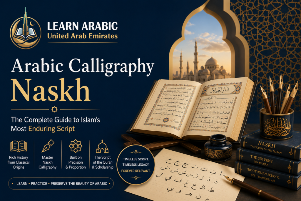
Arabic calligraphy Naskh is the script you are reading right now — not metaphorically, but literally. Every standard Arabic font on your phone, laptop, and printed Quran descends directly from the Naskh hand developed over a thousand years of Islamic scholarship. Yet most people who encounter it daily have never learned what makes it distinct, why it replaced all other scripts for Quranic copying, or what it actually takes to write it well.
This guide answers all of that, drawing on the script’s complete history from its first-century origins through its Ottoman refinement and into its modern digital life.
What Is Arabic Calligraphy Naskh?
Arabic calligraphy Naskh is a small, round, highly legible script that became the dominant hand for transcribing the Quran and is now the basis for virtually all printed and digital Arabic text. The name comes from the Arabic verb nasakha — meaning “to transcribe or copy” — which describes exactly what the script was built to do.
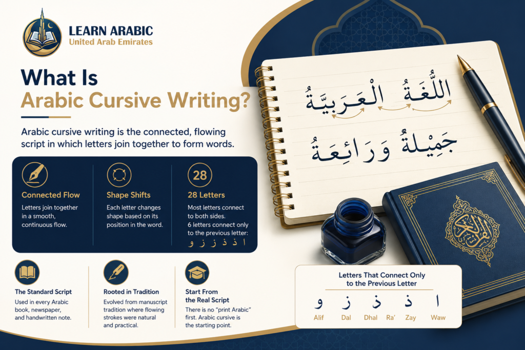
Thomas van Erpe, writing in his 1617 Grammatica Arabica, defined Naskhi characters as “the noblest and true writing style.” That reputation was not accidental. Naskh earned it by solving a problem no other script had fully cracked: how to write Arabic quickly, clearly, and beautifully at the same time.
Why “Naskh” and Not Another Script?
The answer lies in balance. Naskh divides equally between flat and round shapes, and between heavy and light strokes. Letters lean slightly to the left, descending letters end in a characteristic upward hook, and the alif bends gently to the lower left. The result is a rhythm on the page that the eye follows without effort — which is precisely why it was chosen over the more angular Kufic for copying the Quran.
The History of Naskh Arabic Calligraphy
The history of Naskh Arabic calligraphy spans more than 1,000 years. Its development can be divided into three major stages: its early emergence during the Umayyad period, its mathematical standardization by Ibn Muqla, and its refinement under the Ottoman masters.
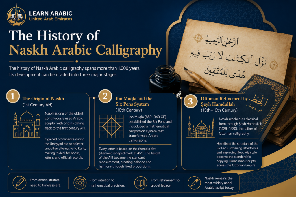
1. The Origin of Naskh (1st Century AH)
Naskh is one of the oldest continuously used Arabic scripts, with origins dating back to the first century AH. It gained prominence during the Umayyad era, when Caliph Abd al-Malik ibn Marwan encouraged the development of a script better suited for administrative writing.
At the time, Kufic was the dominant script. While its bold angular forms were ideal for architecture and early Quran manuscripts, they were slow to write and impractical for everyday documents. Naskh emerged as a faster, smoother alternative, making it easier to copy books, letters, and official records by hand.
2. Ibn Muqla and the Six Pens System (10th Century)
The greatest turning point in Naskh’s history came in the 10th century with the work of Ibn Muqla (859–940 CE), the Abbasid vizier and master calligrapher.
He established the famous Six Pens (Al-Aqlam Al-Sitta)—Naskh, Thuluth, Tawqi’, Riqa’, Muhaqqaq, and Rayhani—and introduced a mathematical proportion system that transformed Arabic calligraphy.
Instead of drawing letters by eye, Ibn Muqla based every letter on the rhombic dot, the diamond-shaped mark created by pressing a reed pen at a 45-degree angle. The height of the Alif became the standard measurement, while every other letter was constructed according to fixed proportional relationships.
This geometric system is the reason Naskh appears so balanced and harmonious—and why mastering it requires precision rather than simple imitation.
3. Ottoman Refinement by Şeyh Hamdullah (15th–16th Century)
Naskh reached its classical form during the Ottoman period through the work of Şeyh Hamdullah (1429–1520), often called the father of Ottoman calligraphy.
Working under the patronage of Sultan Bayezid II in Constantinople, Hamdullah refined the structure of the Six Pens by softening Naskh’s letterforms, improving the flow between curves, and reducing the script’s visual heaviness. His revisions produced a cleaner, more elegant style that became the standard for copying Quran manuscripts across the Ottoman Empire.
Today, the Hamdullah style remains the primary reference taught in traditional Arabic calligraphy schools and continues to influence modern Naskh practice.
Step Inside Our Classrooms
Don’t just take our word for it—see our community in action. Click below to watch real, live snippets from our recent classes and experience our engaging teaching style firsthand!
Master Arabic in the UAE
Experience world-class Arabic language training designed for students and professionals in the Emirates.
Book Your Free TrialRead More: Kufic Arabic Calligraphy
Key Visual Characteristics of Naskh Calligraphy
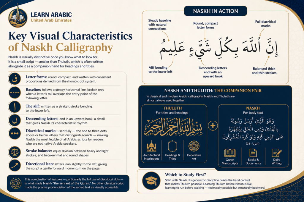
Naskh is visually distinctive once you know what to look for. It is a small script — smaller than Thuluth, which is often written alongside it as a companion hand for headings and titles.
Its defining features are:
- Letter forms: round, compact, and written with consistent proportions derived from the rhombic dot system
- Baseline: follows a steady horizontal line, broken only when a letter’s tail overlaps the entry point of the following letter
- The alif: written as a straight stroke bending to the lower left
- Descending letters: end in an upward hook, a detail that gives Naskh its characteristic rhythm
- Diacritical marks: used fully — the one to three dots above or below letters that distinguish sounds — making Naskh the most legible of all Arabic scripts for readers who are not native Arabic speakers
- Stroke balance: equal division between heavy and light strokes, and between flat and round shapes
- Directional lean: letters lean slightly to the left, giving the script a gentle forward momentum on the page
This combination of features — particularly the full use of diacritical dots — is what made Naskh “the servant of the Quran.” No other classical script made the precise pronunciation of the sacred text as visually accessible.
Naskh and Thuluth: The Companion Pair
In classical and modern Arabic calligraphy, Naskh and Thuluth are almost always used together. Thuluth — a larger, more decorative script — handles titles, headings, and architectural inscriptions. Naskh handles the body text. This pairing appears in Quran manuscripts, mosque architecture, and contemporary Islamic art. If you are learning Naskh, understanding its relationship to Thuluth is part of the full picture.
Learners sometimes ask which to study first. The practitioner answer: start with Naskh, because its geometric discipline builds the hand control that makes Thuluth possible. Learning Thuluth before Naskh is like learning to run before walking — technically possible but structurally backward.
Read More: Thuluth Arabic Calligraphy
Why Naskh Is the Hardest Classical Script to Master?
The source material notes this directly: because Naskh letter shapes are based on different proportions than the other scripts, it is hard to learn to write Naskh well. This is not a minor caveat — it is a central fact about the script that most introductory articles gloss over.
When you study Thuluth, Diwani, or Ruq’a, you are working within proportion systems that share certain foundational assumptions. Naskh’s geometric system — the rhombic dot standard set by Ibn Muqla — is internally consistent but structurally distinct. A student who has spent years on Thuluth cannot simply transfer those proportional instincts to Naskh. The hand must be retrained to a different scale and ratio.
This is a practical learning decision for anyone considering Arabic calligraphy seriously: if your goal is to write the Quran in classical script, Naskh is the correct target. If your goal is decorative or architectural calligraphy, Thuluth may serve you better. Knowing this at the start saves years of misdirected practice.
At Learn Arabic UAE, our Arabic language and calligraphy instructors can help you identify the right script focus for your specific goals and guide you from the fundamentals upward.

Modern Uses of Naskh Arabic Calligraphy
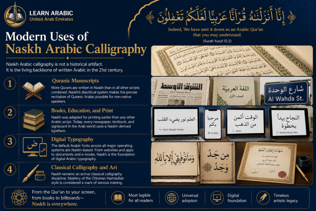
Naskh Arabic calligraphy is not a historical artifact. It is the living backbone of written Arabic in the 21st century.
1. Quranic Manuscripts
More Qurans are written in Naskh than in all other scripts combined. This has been true since Naskh displaced Kufic as the preferred Quranic script in the 10th and 11th centuries. The displacement was practical, not political: Naskh’s diacritical system made the precise recitation of Quranic Arabic possible for non-native speakers, while Kufic’s ambiguity created too many opportunities for error.
2. Books, Education, and Print
Naskh was adapted for movable type and printing earlier than any other Arabic script. When Gutenberg-era printing technology reached the Arabic-speaking world, Naskh was the natural choice because its geometric regularity translated better to metal type than the more fluid, calligraphic scripts. Today, every newspaper, textbook, and signboard in the Arab world uses a Naskh-derived typeface.
3. Digital Typography
The default Arabic fonts across all major operating systems — Windows, iOS, macOS, Linux — are Naskh-based. Examples include Times New Roman Arabic, Arial Arabic, Noto Naskh Arabic (Google Fonts), Amiri, Scheherazade New, and SF Arabic (Apple). When a developer or designer selects an Arabic font for a website, app, or document, they are almost certainly working within the Naskh tradition, whether they know it or not. This makes Naskh the first script any student of Arabic typography should understand.
4. Classical Calligraphy and Art
Naskh remains an active classical calligraphy discipline. Competitions, exhibitions, and certification programs — particularly in Turkey, Egypt, Iran, and the Gulf — continue to use Naskh as a primary examination script. Mastery of the Ottoman Hamdullah style specifically is considered a mark of serious training.
See Our Classroom Environment in Action
Experience a sneak peek into our live sessions. Watch the video below to see our specialized instructors interacting with students, breakdown complex texts, and cultivate an engaging, respectful learning environment.
Master Arabic in the UAE
Experience world-class Arabic language training designed for students and professionals in the Emirates.
Book Your Free TrialMaster Naskh Arabic Calligraphy with Learn Arabic UAE
Learning Naskh properly requires more than watching videos or tracing letters from a book. The rhombic dot proportion system is a practical discipline — one that requires a trained eye looking at your work and correcting your pen angle, pressure, and letter spacing in real time.
At Learn Arabic UAE, our instructors bring structured, expert-guided Arabic instruction that covers both language and script foundations. Whether you are beginning with the Arabic alphabet or advancing toward classical Naskh calligraphy, our courses are designed to build the skills that last.
Book your free trial lesson today
Our Arabic courses
- Arabic Classes for Adults
- Arabic Grammar Course
- Learn Arabic Alphabet Course
- Modern Standard Arabic (MSA) Course
- Quranic Arabic Course
- Fusha Arabic Course
- Classical Arabic Course
- Emirati Arabic Course
- Gulf Arabic Course
- Learn Saudi Arabic
- Business Arabic Course UAE
- Arabic Language Classes for Professionals in UAE
Master Arabic in the UAE
Experience world-class Arabic language training designed for students and professionals in the Emirates.
Book Your Free TrialConclusion
Arabic calligraphy Naskh is the script that carried the Quran across a thousand years of Islamic civilization, trained generations of scribes in geometric precision, and eventually became the typeface running on every Arabic-capable device in the world. Its name means “to copy,” and it has done exactly that — copying itself forward through every era of Arabic writing history.
Understanding Naskh means understanding that it is not simply decorative. It is a precision system, defined by Ibn Muqla’s rhombic dot proportions, refined by Şeyh Hamdullah’s Ottoman mastery, and still alive in every printed page of Arabic text you encounter today. That continuity is what makes it worth studying seriously.
Frequently Asked Questions About Arabic Calligraphy Naskh
Naskh is one of the most studied and widely used Arabic calligraphy styles, yet many beginners have similar questions before they start learning it. Below are clear answers to the most frequently asked questions about the history, characteristics, learning process, and modern use of Naskh Arabic calligraphy.
What does “Naskh” mean in Arabic?
Naskh comes from the verb nasakha, meaning “to transcribe or copy.” The name reflects the script’s primary historical use: copying books, administrative documents, and the Quran.
When was Naskh Arabic calligraphy developed?
Naskh can be traced to the first century of the Islamic calendar. It was codified as one of the Six Pens (al-aqlam al-sitta) by the calligrapher Ibn Muqla in the 10th century and significantly refined by Ottoman master Şeyh Hamdullah in the 15th–16th century.
How is Naskh different from other Arabic calligraphy styles?
Naskh is a small, round, highly legible script built on a strict geometric proportion system. It uses full diacritical marks, follows a steady baseline, and balances flat and round shapes equally. Unlike Thuluth or Diwani, it was designed for functional readability first — which is also why it became the basis for printed and digital Arabic fonts.
Why is Naskh considered difficult to learn?
Naskh uses a different proportion system than most other Arabic scripts, based on the rhombic dot standard set by Ibn Muqla. Students who have experience in other scripts must retrain their proportional instincts. Executing the geometric precision required — pen angle, stroke weight, letter ratio — takes structured practice under expert supervision.
Is Naskh used in modern Arabic typography?
Yes. Naskh is the basis for virtually all modern Arabic typefaces, including standard system fonts on Windows, iOS, macOS, and Linux. Arial Arabic, Times New Roman Arabic, Noto Naskh Arabic, and Amiri are all Naskh-derived fonts in widespread use today.
What is the difference between Naskh and Thuluth calligraphy?
Naskh is a small, precise script used for body text, manuscripts, and Quranic copying. Thuluth is a larger, more decorative companion script used for titles, headings, and architectural inscriptions. The two are traditionally paired — Thuluth for display, Naskh for content. Most classical calligraphers study Naskh before Thuluth because its geometric discipline builds the foundational hand control that Thuluth requires.
Related Articles
Learn Arabic



Leave a Reply