 Learn Arabic
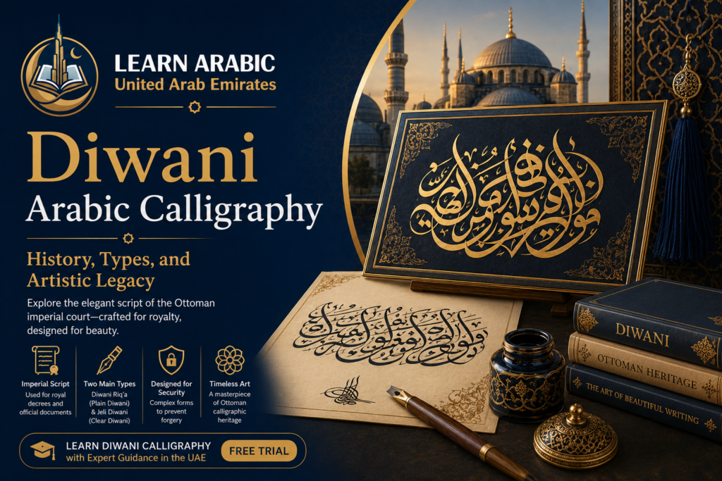
Diwani Arabic calligraphy is one of the most visually striking scripts in the Islamic artistic tradition — and one of the hardest to master. Its letters curve, intertwine, and compress into compositions so dense that forgery is nearly impossible. If you have ever seen an ornate Ottoman royal decree or a ceremonial Arabic inscription that looked more like architecture than handwriting, you were almost certainly looking at Diwani.
This article covers everything you need to understand Diwani script: where it came from, how it differs from other calligraphic styles, the two main types, and why it still matters in formal Arabic writing today.
What Is Diwani Arabic Calligraphy?
diwani script arabic calligraphy is a cursive calligraphic style of the Arabic script developed during the early Ottoman period, specifically during the 16th and early 17th centuries. It takes its name from the Ottoman diwan — the imperial council and administrative apparatus of the sultanate — because it was the official script used to write royal decrees, endowments, and sultanic resolutions.
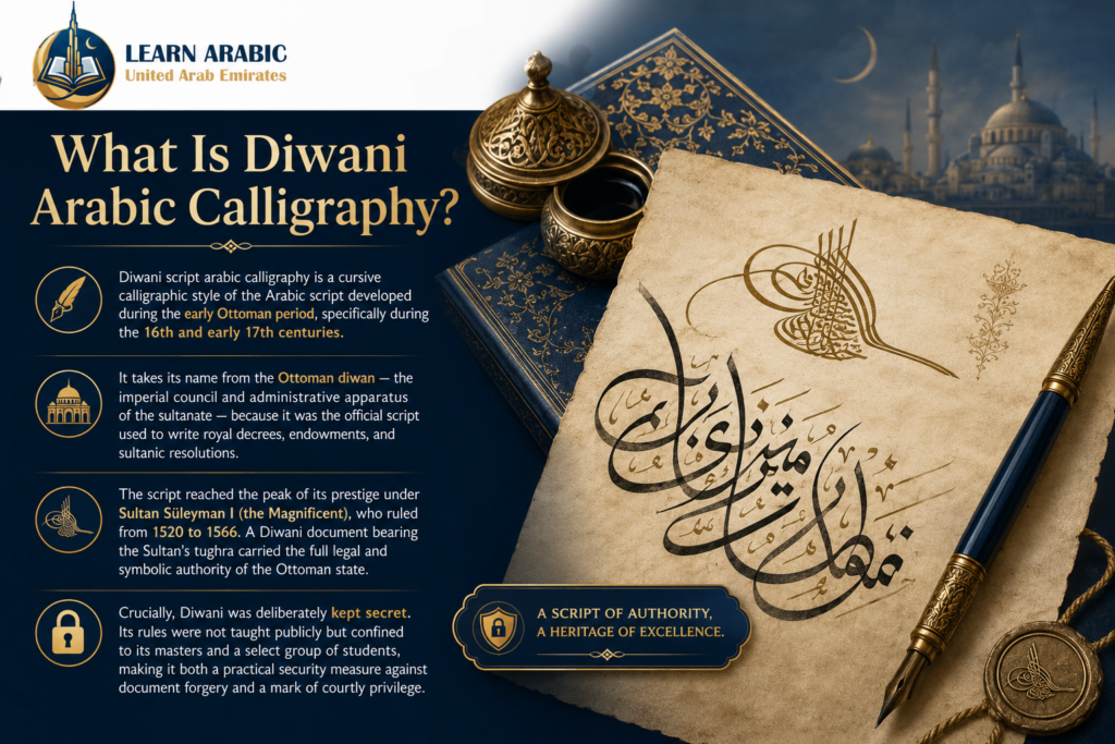
The script reached the peak of its prestige under Sultan Süleyman I (the Magnificent), who ruled from 1520 to 1566. A Diwani document bearing the Sultan’s tughra — a complex calligraphic seal embedding the ruler’s name — carried the full legal and symbolic authority of the Ottoman state.
Crucially, Diwani was deliberately kept secret. Its rules were not taught publicly but confined to its masters and a select group of students, making it both a practical security measure against document forgery and a mark of courtly privilege.
If you are deepening your understanding of the Arabic script more broadly, the Arabic Writing Course at Learn Arabic UAE provides structured instruction in Arabic letterforms and script styles from the ground up.
Join Our Arabic Writing Course in the UAE with a FREE Trial

The Ottoman Origins of Diwani Script
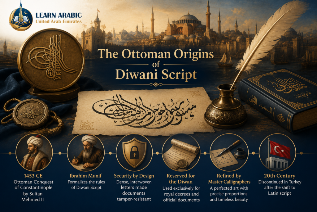
The official recognition of Diwani as a distinct script is directly tied to a single historical moment: the Ottoman conquest of Constantinople in 857 AH (1453 CE) by Sultan Muhammad al-Fatih (Mehmed II the Conqueror).
Ibrahim Munif and the First Rules of Diwani
The calligrapher credited with formalizing Diwani’s rules was Ibrahim Munif, who lived and worked during the reign of Sultan Mehmed II. Before Munif’s codification, the script existed in an earlier, less defined form — a blend of Thuluth, Naskh, and Rayhani influences — and had already seen use during the Seljuk period.
Munif’s contribution was not simply aesthetic. The early Diwani he formalized was intentionally complex: words, letters, and lines were packed together so tightly that no space remained to insert or alter a single character. This deliberate density was a forgery-prevention mechanism built directly into the script’s visual grammar. Official documents in this style were structurally tamper-resistant.
Read also: How to Learn Arabic in 6 Months in the UAE?
The Transition to the Classical Diwani
By the 10th century AH, the script had evolved from its Seljuk-influenced hybrid toward the distinct Diwani form associated exclusively with the Ottoman imperial chancery. From that point, it was reserved for the writings of diwan members — those authorized to compose sultanic grants, charters, and official decrees.
The script was later refined by a succession of master calligraphers. Among the most notable Ottoman practitioners: Grand Vizier Shahla Pasha during the reign of Sultan Ahmed III, the celebrated Hafiz Uthman, and Muhammad Izzat — who went so far as to establish a precise proportional measurement system for Diwani letterforms, calibrating each letter’s dimensions against a specific number of dots. The tradition ultimately reached its final peak in the hands of calligrapher Sami Efendi and a generation of masters including Naseh, Hajj Kamil, and Rajaii.
After the Ataturk reforms in early 20th-century Turkey, Diwani ceased to be actively used for official purposes in its country of origin — a direct consequence of the shift from Arabic to Latin script in Turkish public life.
See Our Classroom Environment in Action
Experience a sneak peek into our live sessions. Watch the video below to see our specialized instructors interacting with students, breakdown complex texts, and cultivate an engaging, respectful learning environment.
Master Arabic in the UAE
Experience world-class Arabic language training designed for students and professionals in the Emirates.
Book Your Free TrialRead More: Arabic Calligraphy Naskh
Read also: How to Learn Arabic in 5 Minutes in the UAE?
The Two Types of Diwani Arabic Calligraphy
Diwani divides into two distinct forms with different visual characteristics, difficulty levels, and intended uses. Understanding the difference is essential before attempting to study or commission either style.
Practitioners and historians consistently describe these as separate scripts requiring separate mastery — not as “basic” and “advanced” versions of the same thing. Each has its own balance of legibility and decoration.
1. Diwani Riq’a (Plain Diwani)
Diwani Riq’a — sometimes called Diwani Khafi (hidden Diwani) — is the simpler of the two types. When someone refers to “Diwani” without qualification, they typically mean this form.
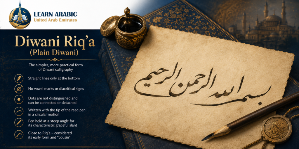
Its defining characteristics: lines are straight only at the bottom, the script carries no decorative diacritical markings or vowel indicators (no tashkeel), and letter dots can be written connected to their letters or detached — and are not visually distinguished from one another.
The script is written with the tip of the reed pen in a rounded, circular motion. Certain normally-disconnected letters — like ra’, waw, alif, and dal — are often connected to the letters that follow them, which contributes to its flowing, uninterrupted visual rhythm. The pen is held at an angle greater than any other Arabic script, giving Diwani Riq’a its characteristic steep slant.
Its closest relative in the Arabic calligraphic family is Riq’a script — to the point that some historians describe the two scripts as “cousins.” Diwani, in its early form, was effectively a development of Riq’a adapted for the prestige context of the imperial chancery.
2. Jeli Diwani (Clear Diwani)
Jeli Diwani is the monumental, fully ornamented version of the script and the form most immediately recognizable in artistic and ceremonial contexts. Jeli (جلي) means “clear” or “manifest” in Arabic, and the name refers not to its legibility — which is actually more challenging — but to its fully expressed visual character.
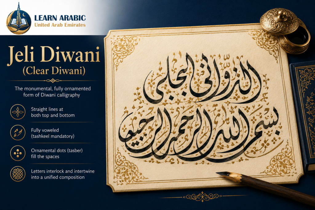
In Jeli Diwani, letters interlock and intertwine across both horizontal axes: lines are straight at both the top and the bottom. The script is fully voweled (tashkeel is mandatory) and additionally decorated with ornamental dots (tasber) that fill the spaces between and around letters until the entire text field appears as a unified, solid composition.
This dot-filling technique is what makes Jeli Diwani appear as a single woven piece rather than a sequence of words. The filling is not random decoration — it follows compositional rules that the master calligrapher controls deliberately to balance visual weight across the text field.
Jeli Diwani is used primarily in decorative and ceremonial contexts: architectural inscriptions, formal proclamations, and works of Islamic art. Its combination of extreme intertwining and dense decoration makes it exceptionally difficult to read without training — and equally difficult to forge.
Read More: Kufic Arabic Calligraphy
The Visual Characteristics of Diwani Script
Diwani script is admired for its elegance, flowing movement, and decorative beauty. Its unique visual structure sets it apart from every other major Arabic calligraphy style, making it both artistic and technically demanding.
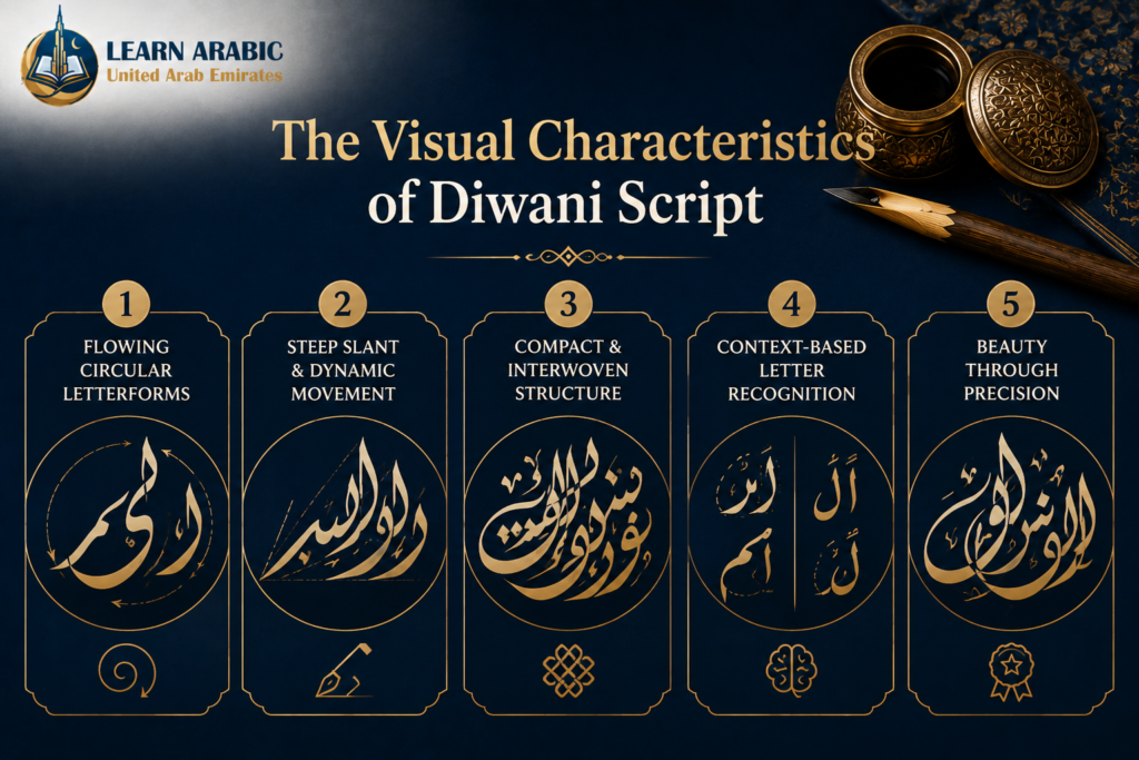
1. Flowing Circular Letterforms
Diwani is built around smooth, rounded curves rather than straight geometric lines. Most letters are formed from interconnected arcs and circles, giving the script its elegant, fluid appearance and graceful rhythm.
2. Steep Slant and Dynamic Movement
Diwani has the strongest letter incline among the major Arabic calligraphy styles. Its letters often rise above or dip below the baseline, creating a lively composition full of movement and visual energy.
3. Compact and Interwoven Structure
Letters are written very close together, with overlapping strokes and tight spacing. This compact arrangement creates a rich decorative effect while making the script more challenging to read than Naskh or Ruq’ah.
4. Context-Based Letter Recognition
One of Diwani’s distinctive characteristics is that similar letters—especially Alif (ا) and Lam (ل) at the beginning of words—can appear almost identical. Skilled readers rely on the overall word structure and linguistic context rather than identifying each letter individually.
5. Beauty Through Precision, Not Size
Traditional Diwani masters believe that the script looks most beautiful when written in a smaller, carefully controlled scale. A compact composition with perfect proportions demonstrates greater technical mastery than a large piece with loose or inconsistent letterforms.
Learning the foundation of Arabic script — including how letterforms connect and shift across positions — is the starting point for any serious engagement with calligraphy. The Arabic Alphabet Course at Learn Arabic UAE covers the structural rules of Arabic letters that every calligraphy student needs.
Read also: The Arabic Letter أ (Alif) – Pronunciation, Writing, and What It Really Means
Start Our Arabic Letters Course in the UAE with a FREE Trial

Read also: The Best 8 Arabic Learning Apps for Kids
Master Calligraphers of the Diwani Tradition
Diwani was shaped by a lineage of named masters whose work defines what correct execution looks like. In Arabic calligraphy education, working from the mashariq (model copybooks) of established masters is the standard method of learning — and Diwani has a clear canon.
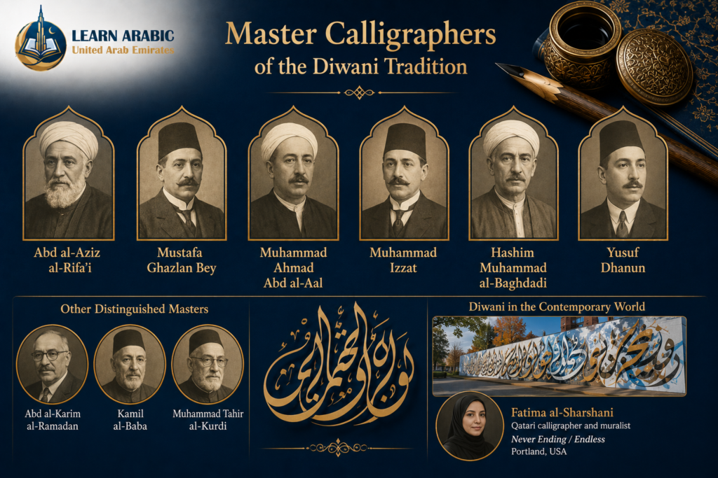
Among those who produced the foundational teaching copybooks (amshaq) for Diwani: Abd al-Aziz al-Rifa’i, Mustafa Ghazlan Bey, Muhammad Ahmad Abd al-Aal, Muhammad Izzat, Hashim Muhammad al-Baghdadi, and Yusuf Dhanun.
Of these, Mustafa Ghazlan holds particular significance in the Arab world. He formalized Diwani’s rules specifically for Arab practitioners — earlier codifications had developed within a Turkish Ottoman context — and elevated its proportional standards to the point that a distinctive sub-tradition, sometimes called al-Ghazlani script, carries his name.
Other masters recognized for Diwani excellence include Hashim Muhammad al-Baghdadi, Yusuf Dhanun, Abd al-Karim al-Ramadan, Kamil al-Baba, and Muhammad Tahir al-Kurdi — figures whose work remains in active circulation as teaching models.
In the contemporary world, Diwani continues to be practiced as a living art form. The Qatari muralist and calligrapher Fatima al-Sharshani works with Diwani script in large-scale public art; her mural Never Ending / Endless is installed in Portland, USA.
How Diwani Arabic Calligraphy Is Used Today?
Despite its origins in Ottoman bureaucracy, diwani script arabic calligraphy has a clear and active role in contemporary formal Arabic contexts.
It remains the preferred script for correspondence among heads of state, royalty, and senior officials — ceremonial letters, formal proclamations, and official diplomatic communications frequently use Diwani for precisely the same reason the Ottoman court adopted it: authority and exclusivity. It also appears in greeting cards, ceremonial invitations, and commemorative works where visual distinction is the primary requirement.
Jeli Diwani specifically has found a strong second life in decorative and architectural contexts: mosque inscriptions, public murals, product branding, and luxury design commissions. Its capacity to fill a defined space with a balanced, dense composition makes it well-suited to monumental decorative work in a way that more open scripts are not.
Understanding the broader landscape of written Arabic — including the formal standard that underlies all calligraphic traditions — is also valuable context. The Modern Standard Arabic (Fusha) Course at Learn Arabic UAE builds the reading and grammatical foundation that connects calligraphic traditions to the living written language.
Begin Your Fusha Arabic Journey in the UAE with a FREE Trial

Step Inside Our Classrooms
Don’t just take our word for it—see our community in action. Click below to watch real, live snippets from our recent classes and experience our engaging teaching style firsthand!
Master Arabic in the UAE
Experience world-class Arabic language training designed for students and professionals in the Emirates.
Book Your Free TrialStart Your Arabic Learning Journey with Learn Arabic UAE
Diwani calligraphy represents one of the highest expressions of Arabic as a written art form. But every calligraphic tradition — from Diwani to Naskh to Kufic — is built on a mastery of the Arabic alphabet, its letter connections, and the structural logic of the script.
Whether you are approaching Arabic as a language learner, a calligraphy student, or someone seeking to read the Quran with comprehension, the path starts with the fundamentals.
At Learn Arabic UAE, expert instructors guide students from first contact with the Arabic alphabet through advanced reading, writing, and grammar — with flexible online sessions designed around your schedule.
Our Arabic courses
- Arabic Grammar Course
- Learn Arabic Alphabet Course
- Modern Standard Arabic (MSA) Course
- Quranic Arabic Course
- Fusha Arabic Course
- Classical Arabic Course
- Emirati Arabic Course
- Gulf Arabic Course
- Learn Saudi Arabic
- Business Arabic Course UAE
- Arabic Language Classes for Professionals in UAE

Master Arabic in the UAE
Experience world-class Arabic language training designed for students and professionals in the Emirates.
Book Your Free TrialConclusion
Diwani Arabic calligraphy is more than a beautiful script — it is a document of Ottoman statecraft, Islamic artistic achievement, and the functional logic of secure writing. Developed in the 16th century as the exclusive script of the sultan’s imperial diwan, it was deliberately designed to be difficult to read and impossible to forge. Its two forms — the flowing Diwani Riq’a and the monumentally complex Jeli Diwani — represent different applications of the same underlying visual philosophy: letters compressed, curved, and interlocked into compositions that carry both meaning and authority.
Its masters — from Ibrahim Munif through Muhammad Izzat to Mustafa Ghazlan — each contributed refinements that the tradition still teaches. And while the Ataturk reforms ended its use in Turkish official life, Diwani continues to appear in royal correspondence, architectural inscriptions, ceremonial documents, and contemporary calligraphic art across the Arab and Islamic world.
Frequently Asked Questions
From its Ottoman origins to its modern-day applications, Diwani remains one of the most fascinating Arabic calligraphy styles. These frequently asked questions cover the essential facts every beginner and calligraphy enthusiast should know.
What is Diwani Arabic calligraphy?
diwani script arabic calligraphy is a cursive Arabic script developed during the early Ottoman period (16th–17th centuries). It was used exclusively for sultanic decrees and royal documents, with rules kept secret within a small circle of court calligraphers to prevent forgery.
What is the difference between Diwani and Jeli Diwani?
Diwani (or Diwani Riq’a) is the plain version — no vowel marks, straight baseline only at the bottom, clean and undecorated. Jeli Diwani is the ornamented version, with mandatory voweling, letter intertwining on both axes, and dense ornamental dot-filling that makes the text appear as a single unified composition.
Why was Diwani script kept secret?
The early Diwani script was intentionally dense — words and letters packed together so tightly that no space remained to insert or alter characters. This design prevented forgery of official Ottoman documents. The rules were restricted to authorized court calligraphers to maintain both the security and the prestige of royal correspondence.
Who invented Diwani calligraphy?
The calligrapher Ibrahim Munif, who lived during the reign of Sultan Mehmed II (the Conqueror), is credited with formalizing Diwani’s rules after the Ottoman conquest of Constantinople in 1453 CE. Later masters — particularly Muhammad Izzat and Mustafa Ghazlan — significantly refined the script’s proportional standards and extended its rules to Arab practitioners.
Is Diwani script still used today?
Yes. Diwani remains in use for royal and presidential correspondence, ceremonial invitations, diplomatic documents, and formal greeting cards. Jeli Diwani is widely used in decorative art, architectural inscriptions, and mosque design.
How difficult is Diwani calligraphy to learn?
Diwani is considered one of the most technically demanding Arabic calligraphic scripts. Its steep letter incline, circular letterforms, compressed compositions, and — in the Jeli form — mandatory decorative filling require extended training under a master. It is not a recommended starting point for beginners; solid grounding in simpler scripts like Naskh or Riq’a is the conventional prerequisite.




Leave a Reply