 Learn Arabic
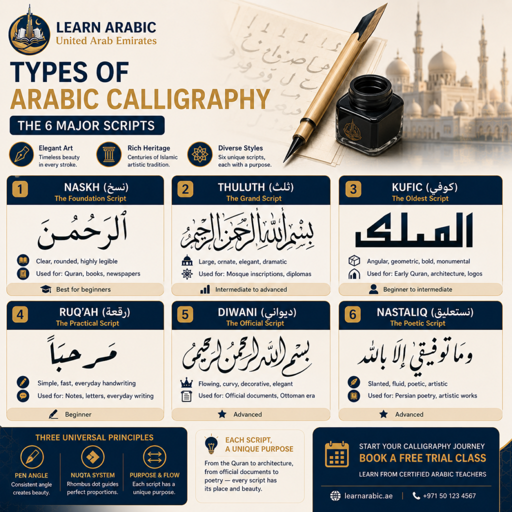
Arabic calligraphy is one of the most celebrated forms of Islamic art, but it is not a single writing style. Instead, it is a collection of classical scripts, each created for a different purpose and defined by its own proportions, letterforms, and visual identity. Understanding these differences is the first step toward appreciating—and learning—the art of Arabic calligraphy.
Arabic calligraphy (Khaṭṭ ʿArabī – خَطّ عَرَبِيّ) is the art of writing Arabic according to precise rules of proportion, pen angle, stroke order, and letter spacing. Its flexibility has allowed calligraphers to develop a variety of scripts, from the geometric Kufic style to the elegant, flowing Nastaliq.
Although every script has unique characteristics, they all share three essential principles: consistent pen angle, the rhombus dot (nuqta) system for letter proportions, and a purpose-driven design. Some scripts were developed for copying the Quran, others for monumental architecture, official documents, or everyday handwriting. These practical needs shaped the six classical styles that remain the foundation of Arabic calligraphy today.
1. Naskh — The Foundation Script
Origin: Iraq, 10th century CE Master calligrapher: Ibn Muqla (d. 940 CE)
Character: Clear, rounded, proportional, highly legible Used for: Quran manuscripts, books, newspapers, digital typography
Naskh (نَسْخ — meaning “to copy” or “transcription”) is the most important Arabic script for any learner to know. It is the style used in virtually all printed and digital Arabic today — the default font on your phone for Arabic text is almost certainly derived from Naskh. When the first moveable-type printing presses arrived in the Arab world in the 18th and 19th centuries, Naskh was the natural choice for typography because of its clarity at small sizes.
Ibn Muqla — a vizier of the Abbasid Caliphate in Baghdad — codified Naskh’s proportional rules in the 10th century, establishing the rhombus dot system that gave the script its mathematical consistency. His work transformed Arabic calligraphy from an intuitive craft into a rule-governed art form.
Visually, Naskh is characterized by rounded, horizontal letter bodies; clear, well-placed dots; consistent letter height; and high legibility even at small sizes. It reads as clean, balanced, and approachable — which is precisely why it became the script of choice for Quran printing from the 10th century onward and remains the foundation of Arabic typography today.
For learners: Naskh is the correct starting point, without exception. Its rule-based proportions give beginners a reliable framework. Every other script becomes easier to understand once Naskh letterforms are internalized.
Build a Strong Arabic Foundation with a FREE Trial Class
2. Thuluth — The Grand Ceremonial Script
Origin: Iraq/Egypt, 9th century CE Master calligrapher: Yaqut al-Musta’simi (d. 1298 CE)
Character: Large, stately, ornate, dramatic Used for: Mosque inscriptions, architectural decoration, diploma certificates
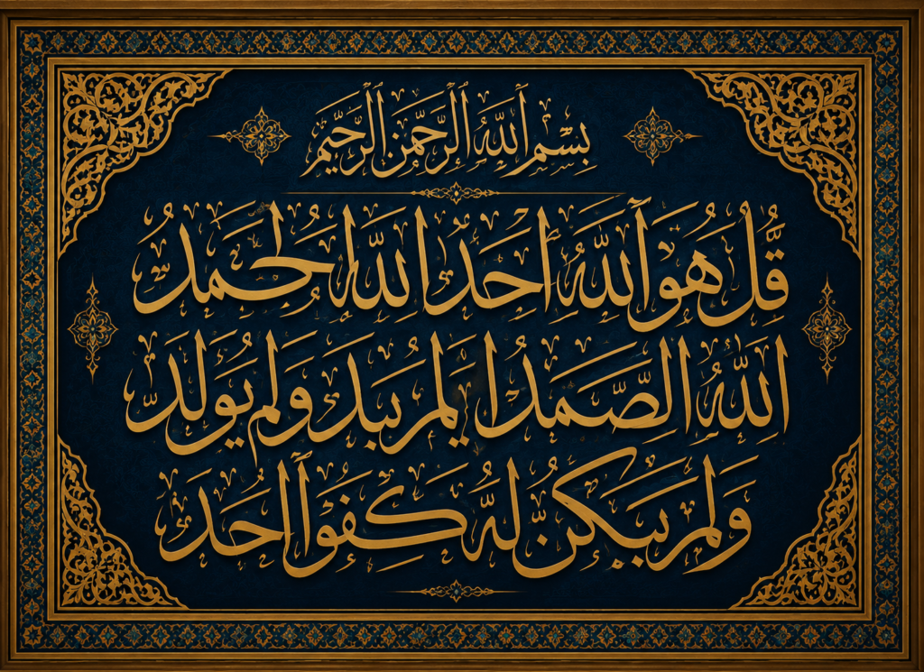
Thuluth (ثُلُث — meaning “one third,” referring to the proportion of curved to straight strokes) is the most prestigious of all Arabic calligraphy styles. It is the script classical calligraphers spent years mastering before attempting any other advanced style — the standard against which all other Arabic scripts have historically been measured.
Where Naskh is built for legibility and compact proportion, Thuluth is built for visual impact. Letters are tall and sweeping, with long ascenders and descenders that can overlap and interlock across multiple words. Curved elements are deep and pronounced. Ligatures — joined letter combinations that create new composite forms — are abundant.
Yaqut al-Musta’simi, the Abbasid court scribe who perfected Thuluth and is said to have continued practicing his art during the Mongol sack of Baghdad, introduced the slanted pen nib cut — a seemingly minor change that fundamentally altered the stroke variation and aesthetic of the script.
Famous Thuluth inscriptions include the verses inside the Dome of the Rock in Jerusalem, the calligraphy on the Kiswah (the covering cloth of the Kaaba), and the inscriptions throughout the Hagia Sophia in Istanbul.
For learners: Thuluth is an intermediate-to-advanced script. Attempting it before mastering Naskh proportions consistently produces foundational errors that take months to correct. It is the goal, not the starting point.
See Our Classroom Environment in Action
Experience a sneak peek into our live sessions. Watch the video below to see our specialized instructors interacting with students, breakdown complex texts, and cultivate an engaging, respectful learning environment.
Master Arabic in the UAE
Experience world-class Arabic language training designed for students and professionals in the Emirates.
Book Your Free TrialRead More: How to Write Arabic Letters in Calligraphy?
3. Kufic — The Oldest Angular Script
Origin: Kufa, Iraq, 7th century CE
Character: Angular, geometric, bold, monumental
Used for: Early Quran manuscripts, coins, architecture, modern logos and branding
Kufic (كُوفِي) is the oldest distinct Arabic calligraphy style — the script in which the first written copies of the Quran were produced. Named after the city of Kufa in modern Iraq, it dominated Arabic writing from the 7th to the 11th century before the rise of the rounded cursive scripts.
Unlike every other major Arabic script, Kufic is fundamentally angular and geometric. Early Kufic used almost entirely horizontal and vertical strokes with sharp right-angle turns. Letters are wide and flat rather than tall, spreading horizontally. Early Kufic manuscripts had no letter dots and no vowel marks — readers needed to know the text already in order to read it.
Over time, numerous Kufic sub-styles developed. Simple Kufic retains clean geometric forms. Foliated Kufic adds leaf and floral extensions growing from the letter ascenders. Plaited Kufic interweaves letterforms like knotwork. Square Kufic — the most extreme variant — replaces all curves with right angles, producing letterforms that tile into grid-based architectural patterns.
Kufic’s geometric boldness makes it the most widely used script in contemporary branding and visual design. Its angular, structured quality reads as historic, authoritative, and visually strong at any scale.
For learners: Kufic is a legitimate starting point for learners whose primary goal is geometric Arabic art or logo design. For those pursuing classical calligraphy or Arabic writing fluency, Naskh remains the correct foundation.
Improve Your Arabic Writing Skills with a FREE Trial Class
4. Diwani — The Ottoman Court Script
Origin: Ottoman Empire, 15th–16th century CE
Master calligrapher: Housam Roumi (under Sultan Suleiman the Magnificent)
Character: Flowing, compressed, ornate, ascending baseline
Used for: Official Ottoman documents, royal decrees, decorative art, certificates
Diwani (دِيوَانِي — from dīwān, the Ottoman royal court and chancellery) was developed as the official script of state documents in the Ottoman Imperial court. It reached its peak in the 16th century under the great Ottoman calligraphers working for Sultan Suleiman the Magnificent.
Diwani is instantly recognizable by its compressed, upward-tilting baseline. Unlike every other Arabic script, where letters sit on a horizontal line, Diwani text curves upward from right to left, giving each written line a soaring, wave-like quality. Letters are tightly compressed and highly connected, with dots placed inside letter bodies.
Its deliberate visual complexity served a security function. Only authorized scribes trained in the script could produce it convincingly — making forged official documents effectively impossible for anyone outside the court calligrapher’s guild.
Diwani Jali — the elaborated variant — adds intricate decorative fills between letters, pushing the composition to the boundary of legibility. It was used specifically to prevent forgery of the most important imperial decrees.
Today Diwani is used primarily for decorative contexts: wedding invitations, personalized name pieces, certificates, and artistic calligraphy compositions where flowing elegance takes precedence over immediate readability.
Read More: How to Write Arabic in Keyboard English?
5. Ruq’a — The Everyday Handwriting Script
Origin: Ottoman Empire, 19th century CE
Character: Compact, simplified, fast, practical
Used for: Everyday handwriting, notes, menus, informal signage
Ruq’a (رُقْعَة — meaning “a piece of cloth” or “a patch,” suggesting small, everyday writing) is the practical everyday handwriting style of the Arabic-speaking world. When an Arab student takes notes in class, when a shopkeeper writes a receipt by hand, or when someone jots a quick message — they are using Ruq’a.
Developed within the Ottoman educational system in the 19th century, Ruq’a was designed for speed and ease, not for artistic complexity. Its distinguishing features are short, compact letters with minimal vertical extension; simplified letterforms where some letters are reduced to quick strokes; letters running close together along a consistent baseline; and dots that are often simplified or merged into a single horizontal mark.
Ruq’a is not a traditional calligraphic art style in the way Thuluth and Naskh are — it is a functional handwriting convention that emerged from practical necessity. That said, there are calligraphers who practice and teach beautiful Ruq’a for its own warm, human aesthetic quality. Restaurant menus, handwritten shop signs, and informal announcements in Arabic countries typically use a clean version of Ruq’a.
For learners: Ruq’a is not the best starting point for calligraphy study, despite its simplicity. Its simplified forms skip the proportional rules that calligraphy instruction builds. Learning Naskh first and Ruq’a second produces better handwriting and better calligraphy.
6. Nastaliq — The Lyrical Persian-Influenced Script
Origin: Persia (Iran), 14th–15th century CE
Master calligrapher: Mir Ali Tabrizi (d. c. 1446)
Character: Sweeping, cascading, diagonal, deeply aesthetic
Used for: Persian poetry, Urdu literature, Pakistani official documents, fine art manuscripts
Nastaliq (نَسْتَعْلِيق — a compound of Naskh and Taʿliq, the two scripts it synthesizes) emerged in 14th-century Persia and became the dominant script for Persian and Urdu writing. Among connoisseurs of Arabic-script calligraphy, it is widely regarded as the most aesthetically beautiful of all the major styles.
Its visual rhythm is entirely unlike any other script. Letter clusters hang from an invisible line and cascade diagonally downward from right to left, with some letters dipping steeply below the baseline while others stay near it. The result is writing that flows like water across uneven ground — full of dynamic movement and visual contrast between wide horizontal letters and narrow, deep descenders.
Mir Ali Tabrizi, to whom the script’s invention is traditionally attributed, reportedly said he was inspired by a dream in which geese showed him the forms of the letters — a legend that captures something genuine about Nastaliq’s organic, flowing quality.
Nastaliq is the dominant calligraphy script in Pakistan — used for Urdu on official documents, newspapers, and cultural materials — and in Persian calligraphy traditions in Iran. It is rarely used for Modern Standard Arabic.
For learners: Nastaliq is an expert-level script and one of the most technically demanding in any calligraphic tradition. It is appropriate only for learners with solid Naskh foundations who have a specific interest in Persian or Urdu calligraphy.
Comparing the 6 Types of Arabic Calligraphy
Each Arabic calligraphy script has its own visual style, purpose, and level of difficulty. The comparison below highlights the key differences between the six classical scripts, making it easier to choose the one that best matches your learning goals and experience level.
| Script | Character | Primary Use | Difficulty | Legibility |
| Naskh | Clear, rounded, steady | Books, digital text, Quran | Beginner | Very high |
| Thuluth | Grand, majestic, ornate | Mosque architecture, diplomas | Advanced | Moderate |
| Kufic | Angular, bold, geometric | Architecture, logos, branding | Intermediate | Moderate |
| Diwani | Flowing, ornate, ascending | Certificates, decoration | Advanced | Low–Moderate |
| Ruq’a | Compact, practical, fast | Everyday handwriting | Beginner | High |
| Nastaliq | Lyrical, cascading, elegant | Persian poetry, Urdu | Expert | Moderate |
Which Type of Arabic Calligraphy Should Beginners Learn First?
The answer is consistent across classical calligraphy teaching traditions: begin with Naskh.
Naskh is used in almost all printed and digital Arabic text, meaning any time invested in learning it transfers immediately to reading newspapers, websites, the Quran, and textbooks. It has the most clearly documented proportional rules — Ibn Muqla’s rhombus dot system — which gives beginners a reliable, self-correcting framework from day one.
Once Naskh letterforms are stable, the recommended progression for serious calligraphy students is:
Starting with Naskh builds proportional intuition and pen control. Moving to Ruq’a develops handwriting speed. Studying Thuluth — considered the “mother of scripts” by classical calligraphers — deepens understanding of letterform relationships and advanced ligatures. Kufic and Diwani follow as specialized artistic pursuits. Nastaliq is appropriate only for those with a specific interest in Persian or Urdu calligraphic traditions.
Learners who attempt Thuluth before mastering Naskh consistently develop foundational errors that take months to correct — incorrect pen angles, inconsistent proportions, and misformed curves that have become habitual. The sequence matters.
Read more: The Best Way to Learn Arabic Vocabulary
The Tools Behind Arabic Calligraphy
All six major scripts were developed with the same primary tool: the Qalam (قَلَم) — a reed pen cut from dried grass or bamboo, with the nib cut at an angle to produce the characteristic thick-and-thin stroke variation that defines Arabic calligraphy’s visual rhythm.
Several traditional pen types serve different purposes. The Khamish pen — made from riverbed reeds — is the standard tool for classical scripts and requires a lengthy curing process before use. The Bamboo pen offers a combination of rigidity and slight flexibility that suits a wide range of scripts. The Java pen, made from Javanese thorngrass, produces an especially sharp edge suited to smaller scripts. The Handam pen — available in nib widths from under 1mm to 10mm — is the most versatile option for learners, requiring less frequent sharpening than traditional reeds.
Paper matters as much as the pen. Ahar paper — handmade in central India and coated with a starch-and-alum sizing — prevents ink from penetrating the surface, allowing calligraphers to correct errors with a damp cloth. Standard printer paper absorbs ink into the fibers, producing fuzzy edges rather than the clean, sharp strokes that define calligraphy at every level.
Traditional Arabic calligraphy ink is soot-based and water-soluble — black carbon ink that dries matte and can be removed before it fully sets. The water-soluble quality is not incidental; it is a feature that allows the slow, deliberate correction process that classical training depends on.
Step Inside Our Classrooms
Don’t just take our word for it—see our community in action. Click below to watch real, live snippets from our recent classes and experience our engaging teaching style firsthand!
Master Arabic in the UAE
Experience world-class Arabic language training designed for students and professionals in the Emirates.
Book Your Free TrialStart Learning Arabic Calligraphy with Structured Guidance
Knowing the six major types of Arabic calligraphy gives you the context to appreciate what you see — in a mosque, in a book, in a logo, in contemporary art. The deeper understanding comes from practicing strokes yourself.
Learn Arabic UAE offers structured Arabic writing and calligraphy instruction with native Arabic instructors, a curriculum built for learners at every level, and flexible scheduling for working professionals and students. Whether you are starting from letter recognition or developing advanced calligraphic technique, expert correction from the first session is what prevents the foundational errors that self-study cannot catch.
[Explore our Arabic courses and start your free trial today →]

Our Arabic courses
- Arabic Course in the UAE
- Arabic Intensive Course
- Arabic Classes for Beginners (Learn Arabic from Scratch)
- Madinah Arabic Course
- Arabic Classes for Adults
- Self-Paced Arabic Course
- Arabic Speaking Classes
- Learn to Write Arabic Course
Master Arabic in the UAE
Experience world-class Arabic language training designed for students and professionals in the Emirates.
Book Your Free TrialConclusion
Arabic calligraphy is not one visual style — it is six major scripts, each developed for a different purpose, in a different historical period, under different cultural conditions. Naskh built for legibility and became the foundation of all printed Arabic. Thuluth built for grandeur and became the script of mosque architecture. Kufic built for geometric strength and became the oldest surviving script tradition. Diwani built for court security and became a byword for flowing elegance. Ruq’a built for daily speed and became the handwriting of the Arabic-speaking world. Nastaliq built for lyrical beauty and became the defining script of Persian and Urdu literary culture.
Recognizing the differences between these scripts is the first step toward both appreciating Islamic art and understanding what Arabic writing actually is — not a single system, but a living family of traditions that continues to evolve in contemporary design, digital typography, and fine art.
Frequently Asked Questions About Types of Arabic Calligraphy
How many types of Arabic calligraphy are there?
Scholars typically identify six to eight major styles: Naskh, Thuluth, Kufic, Diwani, Ruq’a, Nastaliq, Muhaqqaq, and Maghrebi are the most commonly discussed. Within each major style, there are numerous regional variants and sub-styles — Kufic alone has developed into Square Kufic, Foliated Kufic, Plaited Kufic, and others. The Ottoman calligraphic tradition distinguished and codified at least six discrete scripts.
What is the oldest type of Arabic calligraphy?
Kufic is the oldest distinct Arabic calligraphy style. Named after the city of Kufa in modern Iraq, early Kufic forms were used in the first written copies of the Quran in the 7th century CE. Its angular, geometric letterforms — used without letter dots or vowel marks — represent the earliest systematic Arabic writing tradition.
What is the difference between Naskh and Thuluth?
Naskh is compact, rounded, and optimized for legibility at small sizes — it is the script of books, manuscripts, and digital text. Thuluth is large, sweeping, and ornate, designed for architectural inscriptions and monumental decoration visible from a distance. Thuluth requires significantly more pen control and proportional knowledge than Naskh, which is why classical calligraphy training always begins with Naskh.
Is Arabic calligraphy considered sacred in Islam?
Within Islamic artistic tradition, calligraphy holds a uniquely elevated position because the Arabic script is the medium of the Quran — the direct written form of divine revelation. Writing the words of God beautifully is understood as an act of worship in itself. The Prophet Muhammad is reported to have said “beautiful handwriting makes truth more apparent.” This elevated status drove extraordinary investment in calligraphic training and artistry across the Muslim world for over a thousand years.
What tools are used in traditional Arabic calligraphy?
The primary tool is the Qalam — a reed or bamboo pen with an angled nib cut to produce thick-and-thin stroke variation. Traditional calligraphers use soot-based, water-soluble carbon ink and Ahar paper, a specially coated surface that keeps ink on the surface rather than absorbing it, allowing corrections. Modern practitioners may also use calligraphy markers, digital tablets, and vector design software, though understanding classical proportional principles remains essential for producing balanced letterforms.
Can I learn Arabic calligraphy without knowing how to read Arabic?
Yes — many calligraphy learners begin without reading knowledge. However, learners who understand Arabic letter structure and positional forms (initial, medial, final, isolated) progress significantly faster, because they understand why the same letter looks different in different positions within a word. Learning basic Arabic letter recognition alongside calligraphy practice consistently produces better outcomes than treating the two skills as completely separate.


Leave a Reply